


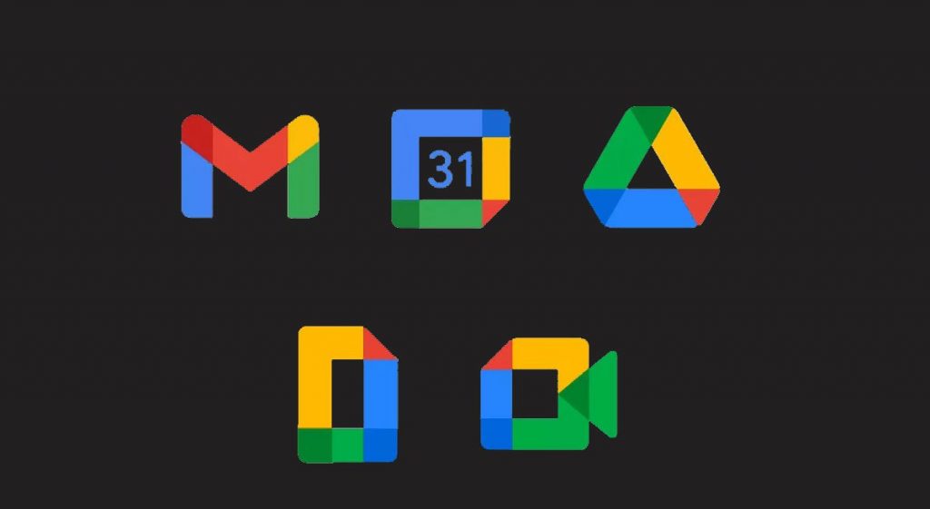
Are you shocked seeing some nasty looking icons on your Android phone? Well, don’t be because Google recently changed the icon design of its apps.
Every once in a while, the design language of software, apps, and icons change. There’s a whole philosophy why design language is important and to summarize it: It’s used to describe the overall design of a digital product.

But sometimes, language gets lost in translation, and you’ll end up with a mishmash of color…